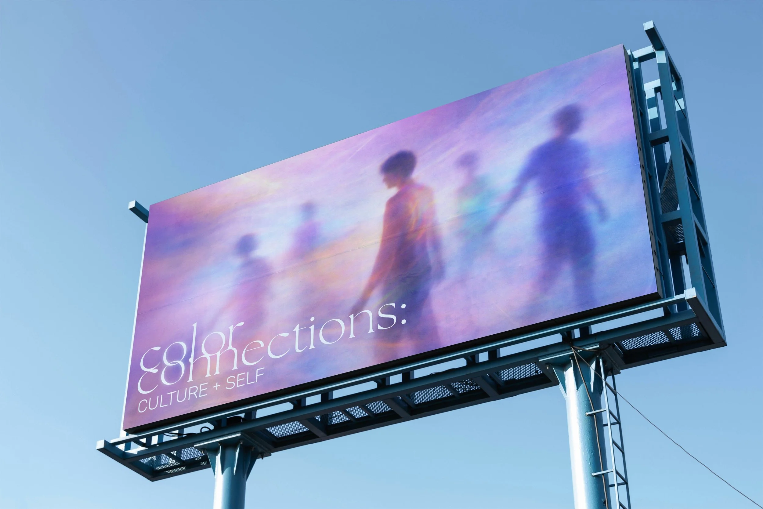
COLOR CONNECTIONS: CULTURE AND SELF
UX/UI DESIGN
PROJECT OVERVIEW
Conceptualize a new exhibit for the Cincinnati Museum Center and design a full digital and physical experience by crafting a cohesive visual language, designing digital products, and creating physical touchpoints to enhance engagement.
WHAT IS COLOR CONNECTIONS?
Color Connections: Culture and Self is a reflective experience encouraging visitors to learn about how cultures perceive colors around the world. Visitors will reflect on these colors and perceptions and put their views in an app. Finally, the app will give visitors their own color identity.
Branding - Art Direction - UX/UI Design | Figma - Adobe Illustrator - Adobe Photoshop - Adobe Firefly

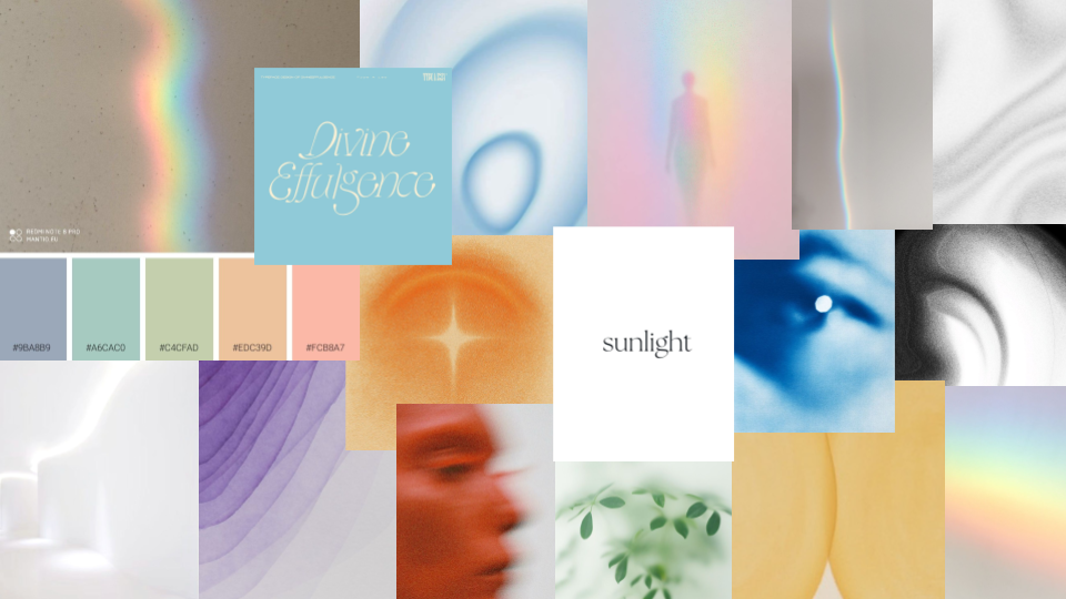
MOOD BOARD
First, I created a mood board that showed visual direction for my exhibit and branding. It’s soft, minimalistic, and light - encouraging users to be reflective in the experience.
DESIGN PROCESS
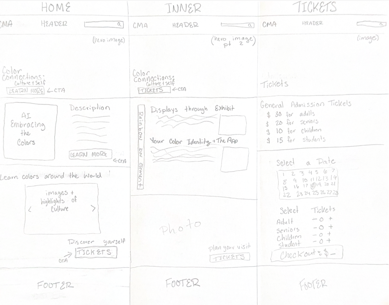
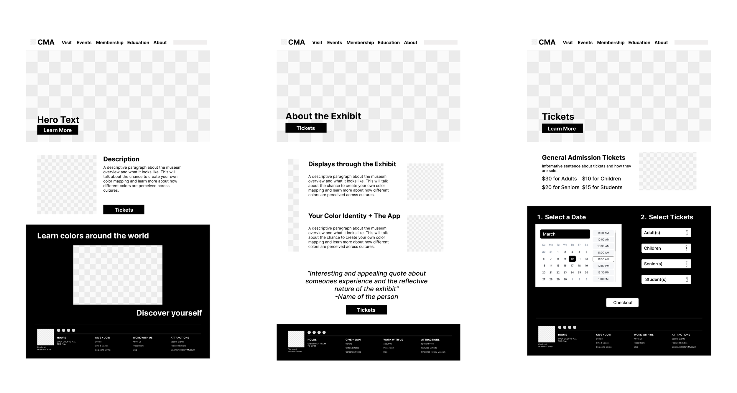
FOR WEB DESIGN
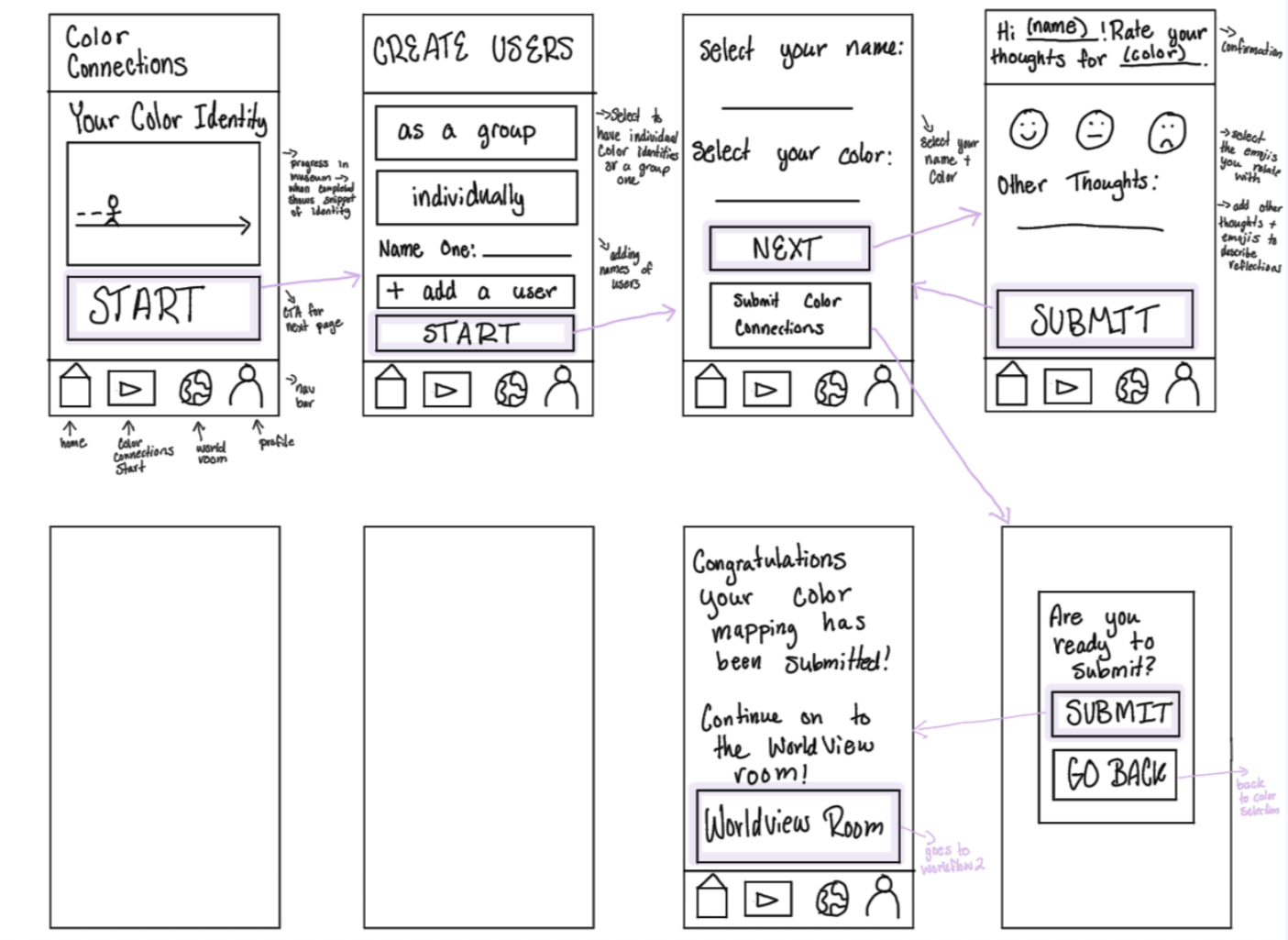
I started the design process with rough sketches of what the exhibit would look like on the Cincinnati Museum Center’s website. Then, these were expanded into low-fidelity designs on Figma.
FOR APP DESIGN
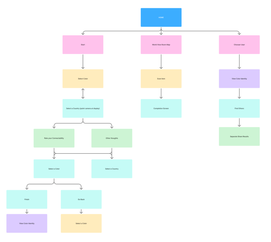
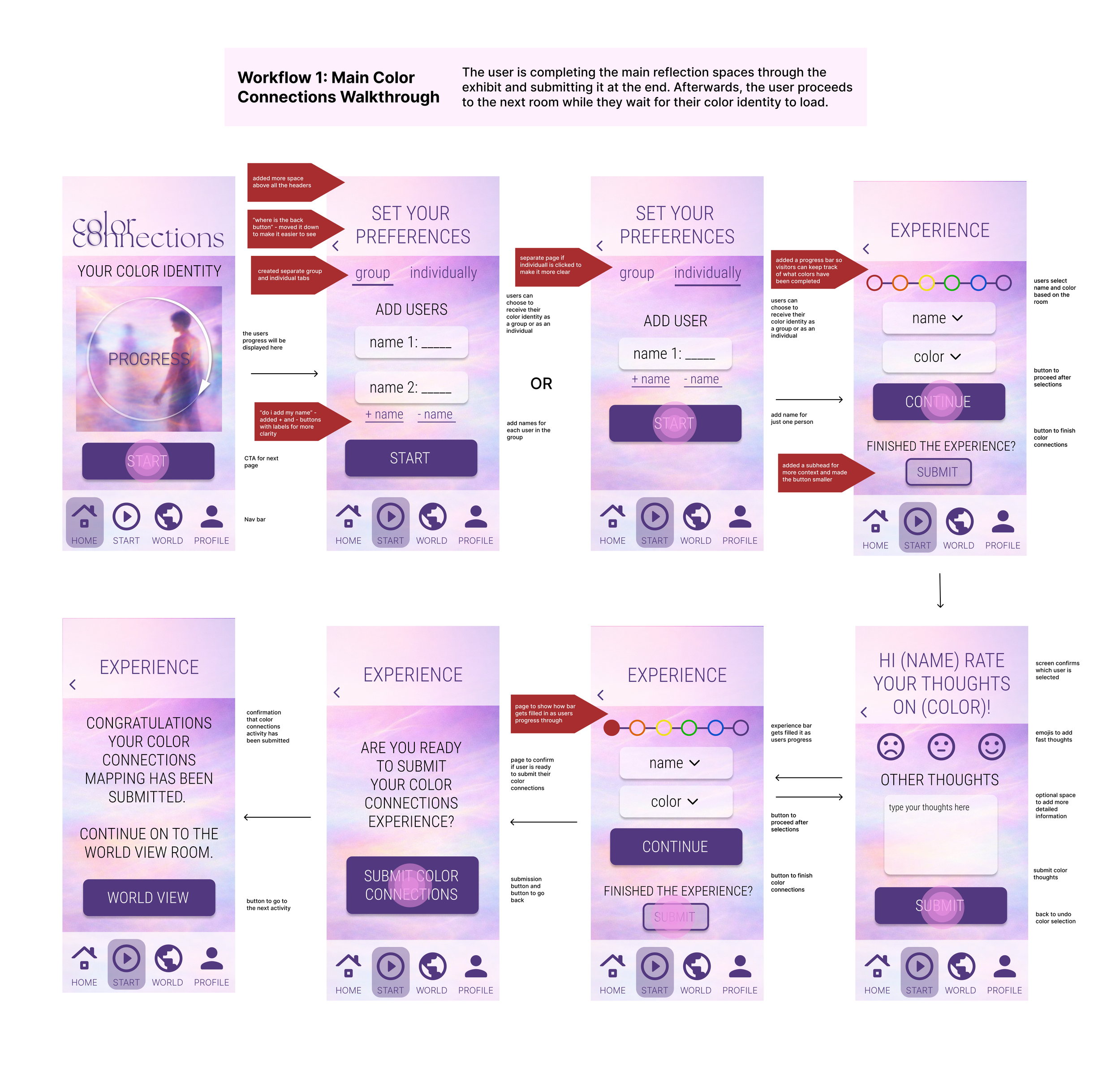
I also created workflows, rough sketches, and low fidelity designs of the app. This helped me understand how the app would function and what the user would think about while completing the exhibit. Afterwards, everything was assembled into a high-fidelity mockup.
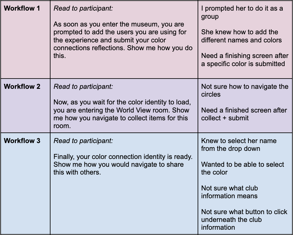
USER TESTING
Once the high-fidelity was completed, I conducted three interviews and had them walkthrough the app. This allowed me to see what parts where confusing to the user, what elements didn’t fit in the frame of a phone, and what technical jumps and connections needed improved. I recorded their thoughts and implemented these changes into my design.
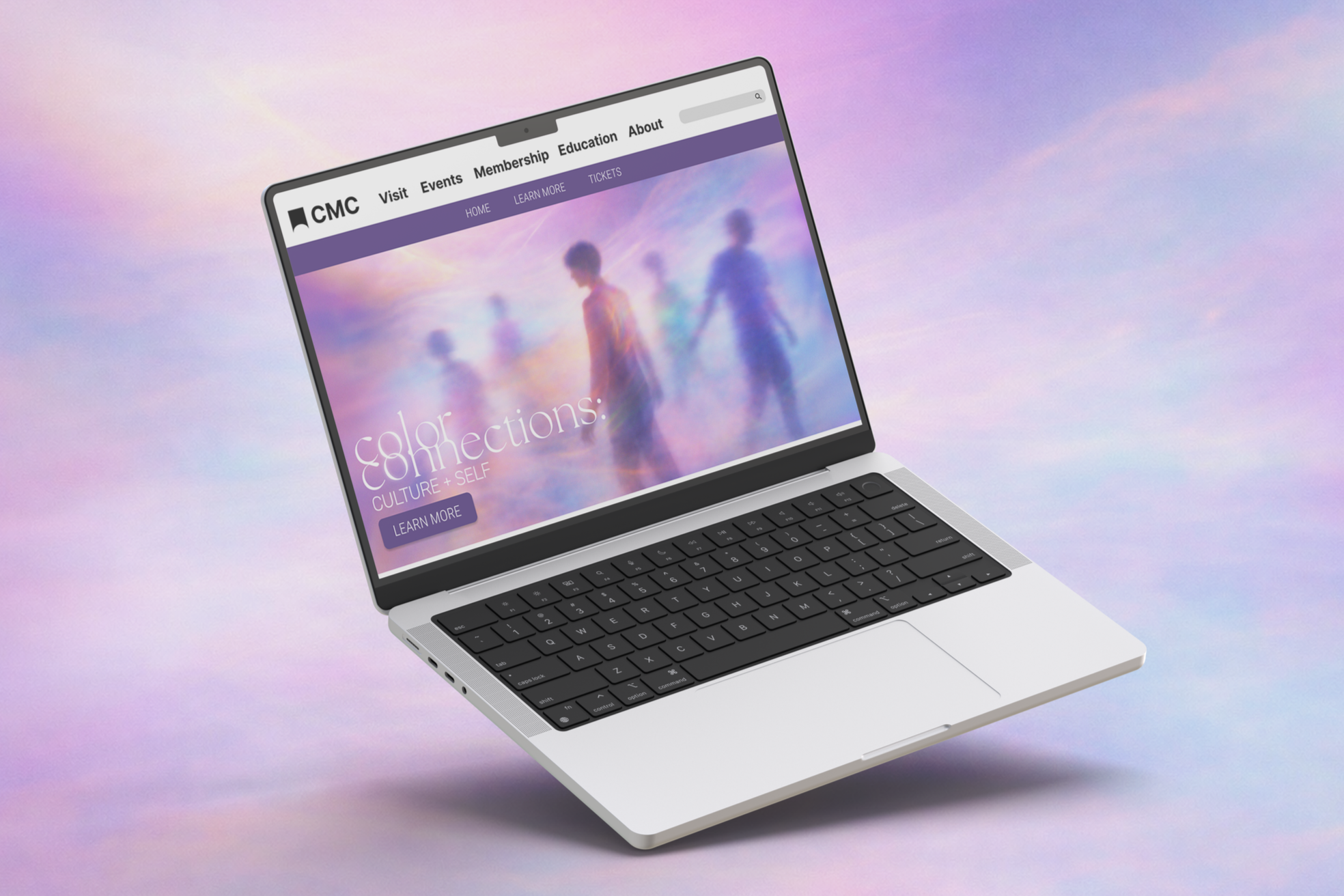
INTERACTIVE WEB DESIGN
The final website design includes a home page, a learn more page, and a tickets page. Each page also includes CTA buttons to encourage the user to buy tickets. There are also photos and quotes giving the user a behind-the-scenes look into the exhibit.
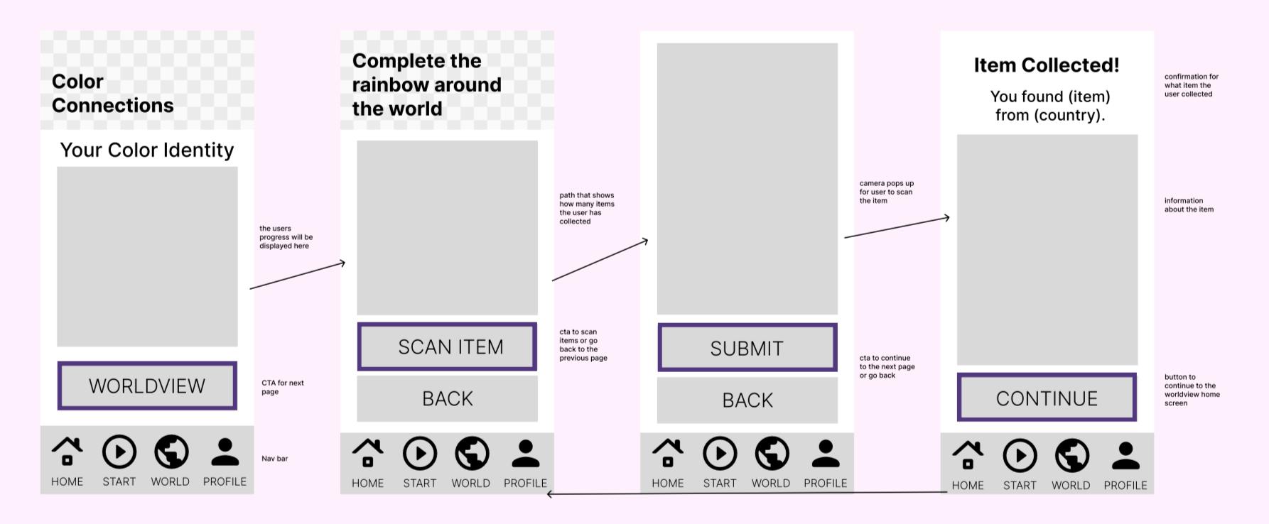
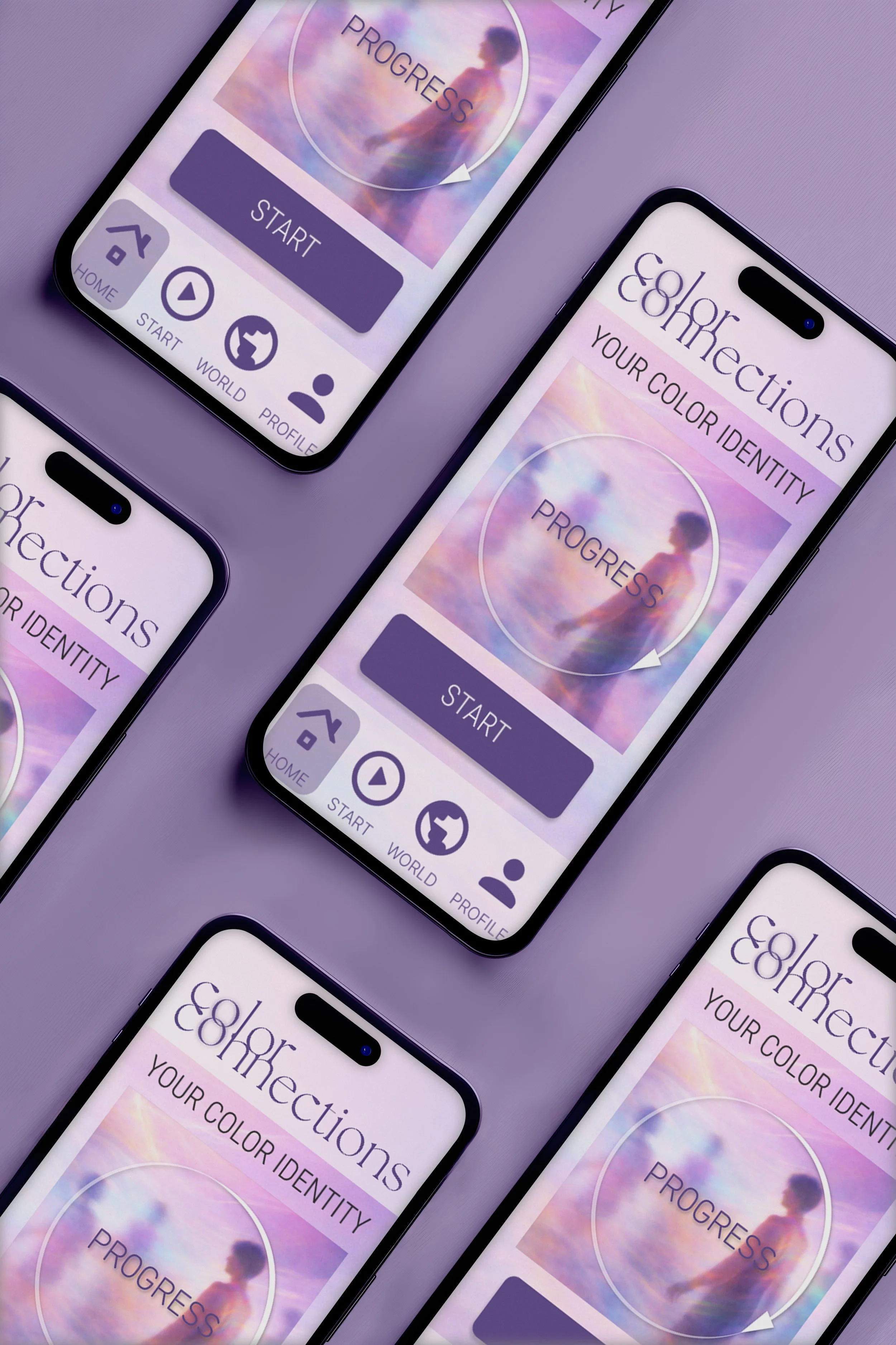
INTERACTIVE APP DESIGN
The app guides the user through the exhibit while also encouraging them to engage. The first part of the app walks the user through the main exhibit. For each color/room they write down their reflections and thoughts. Then, once they finish and their color identity is loading, they are prompted to go to the Worldview room. Here, they collect items around the world to complete the rainbow. Finally, they can head to their profile to see their color identity, find others around the globe, and share their results with others.
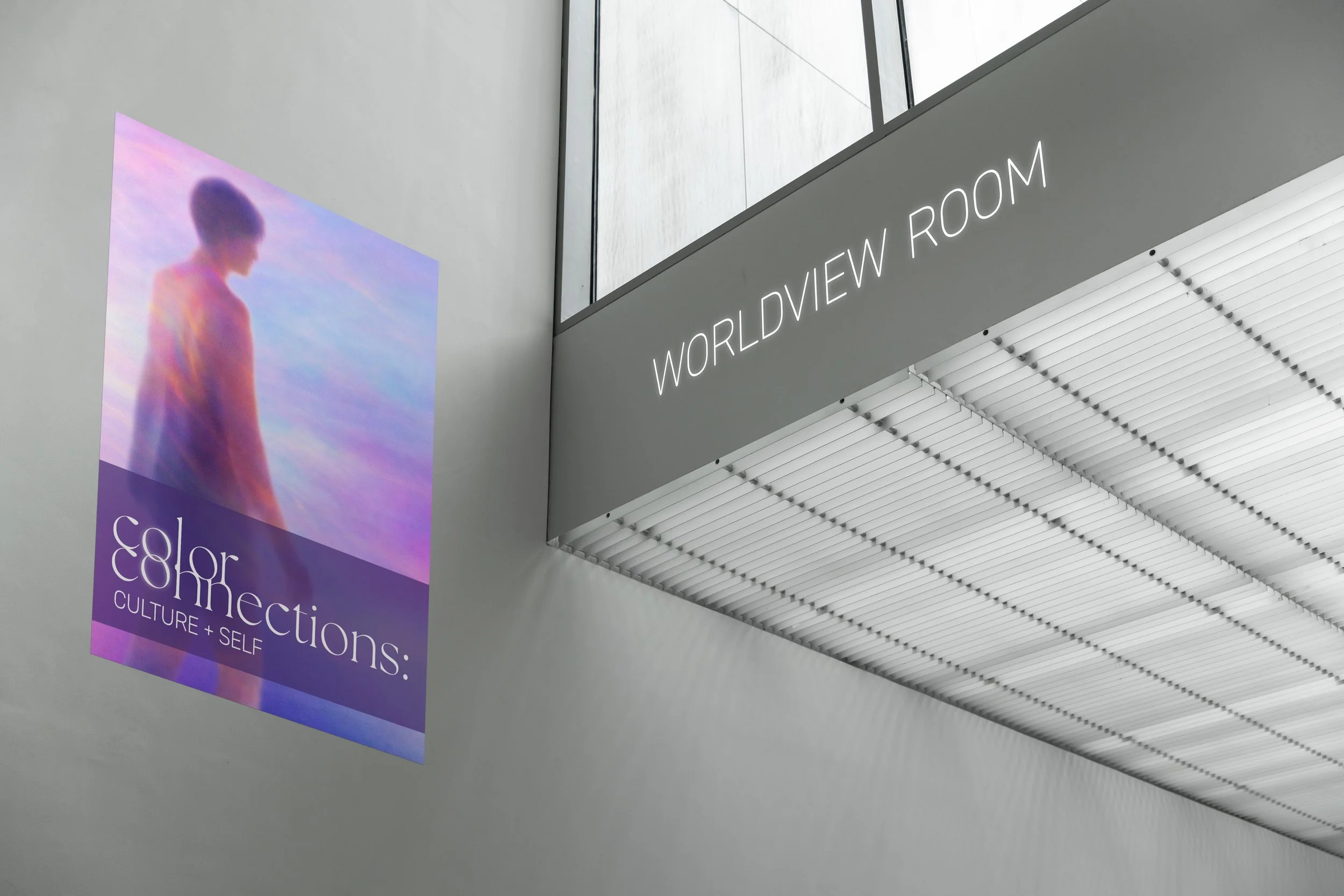
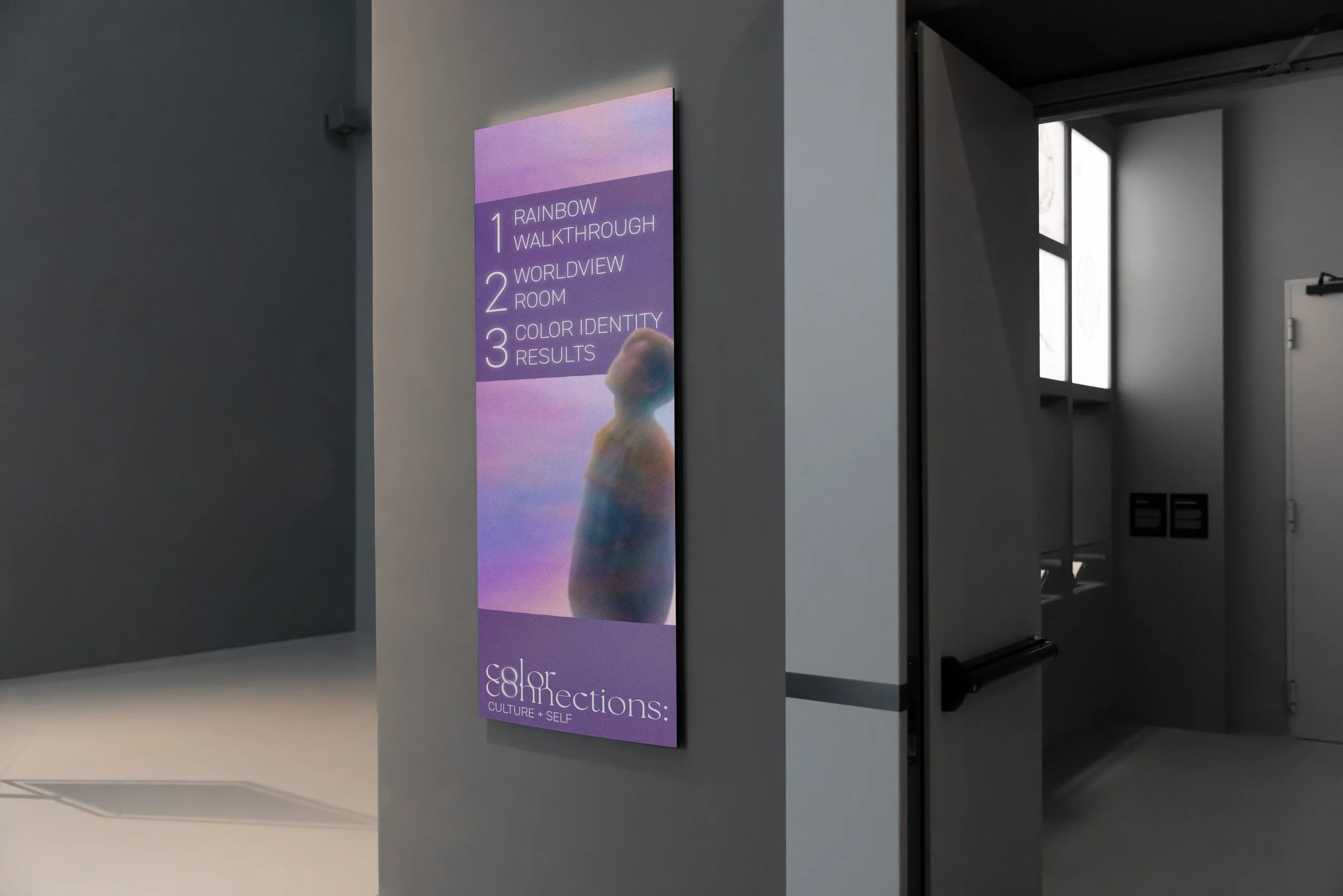
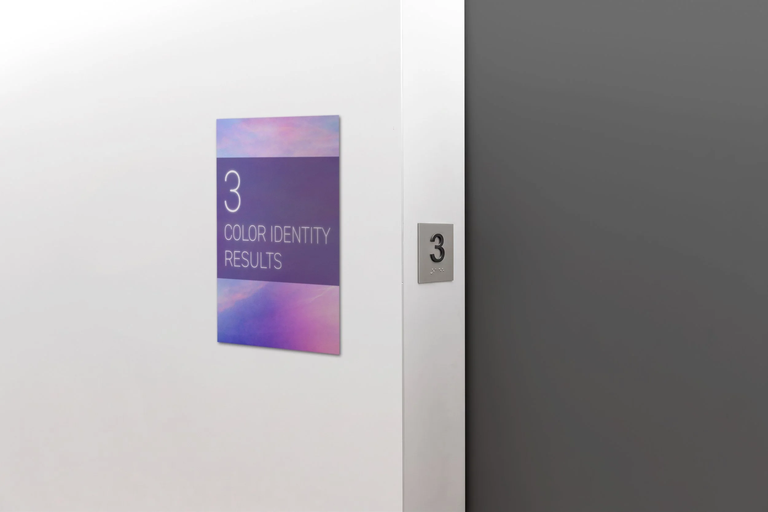
WAYFINDING ELEMENTS
Finally, I created wayfinding elements to guide visitors through the exhibit while also following the branding of the museum.
AI ACKNOWLEDGEMENT
Parts of my work throughout this project were created using AI. I developed the concept, branding, wayfinding elements, and web/app design myself. However, AI was used to create the images seen throughout the design. While I have my own opinions on the use of AI, it is the future. This project allowed me to gain a better understanding of what AI models to use, how to write stronger prompts, and when and when not to use AI.